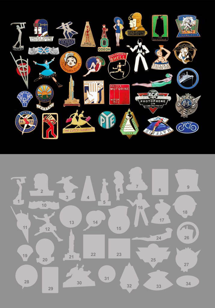
Art Deco wasn’t always something you looked at on a building, poster or cinema screen. Sometimes you could wear it on your lapel (just like our own ADSUK pin badge!) In this article, collector Robert Griffin gives a wonderful insight into this world of mobile advertisements, and showcases his collection.
We tend to associate Art Deco with the monumental and glamorous: soaring architecture, ocean liners, fashionable hotels, expensive jewellery and the bold advertising posters of the 1920s and 30s. Yet the same visual language also found its way onto enamel badges, barely larger than postage stamps. Some were promotional items or souvenirs; others were simply inexpensive. Pinned to an ordinary coat or jacket, they carried Art Deco out of the grand hotel, cinema and advertising hoarding and into everyday life. They were, quite literally, wearable graphics.
Collecting with my eyes
Perhaps my fascination with these little objects was inevitable. I trained as a graphic designer and spent much of my working life teaching art and design, and I suppose I’ve never quite switched off that way of looking. As my collection of early to mid-twentieth-century enamel badges grew, I realised I wasn’t chasing rarity or trying to tick boxes. I was collecting with my eyes.
A beautifully resolved silhouette, an unexpected piece of geometry, the sweep of a swimmer or speedway rider, or clever typography — those were the badges that stopped me in my tracks. Gradually, Art Deco and Modernism formed a collection within the collection. The boundaries between the two are not always precise, and many of these little objects seem perfectly happy occupying the territory between them.
The best squeeze all the graphic confidence of a poster into something you can hold in the palm of your hand.
Wearable graphics
Of course, Art Deco was already wearable through jewellery and decorative brooches. But these little badges were doing something different. Their primary purpose wasn’t simply adornment: they communicated.
They advertised products, declared allegiances, identified membership or staff, promoted clubs or preserved memories of holidays and events. Once pinned to a lapel, the wearer became the carrier of the graphic message.
There is a pleasing contradiction here. Art Deco could represent luxury and exclusivity, yet its visual language was remarkably democratic. You didn’t need expensive jewellery or a fashionable hotel to carry a little piece of modern design around with you. Deco could also arrive as a colourful enamel badge on an ordinary jacket.
This is modern life, miniaturised.
Making the idea smaller
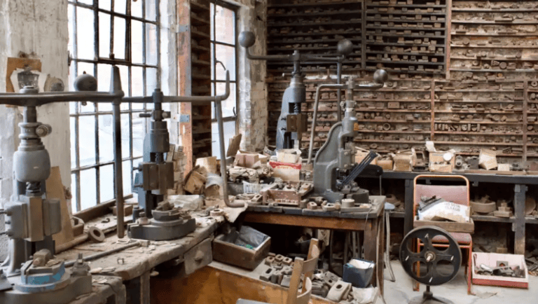
There are two creative forces at play in many of these objects. First comes the graphic idea — perhaps conceived for an advertisement, poster or corporate identity. Then comes the badge maker, translating that idea into metal and enamel, sometimes at little more than an inch across.
This wasn’t simply a matter of shrinking artwork. Fine detail could disappear, lines become impractical and areas of colour had to be separated by raised metal. Decisions were needed about what to retain, strengthen, simplify or leave out.
The challenge was to make the design smaller without making the idea smaller.
In Britain, that journey frequently led to Birmingham. Its Jewellery Quarter brought together specialist metalworkers, die-sinkers, enamellers and manufacturers with precisely the skills these objects demanded. Turn over badges in my collection and Birmingham appears again and again: Fattorini, Sale, Butler, Stratton and Miller among the names stamped into their backs.
The reverse can almost provide a second story: the graphic on the front tells us what was being communicated, while the maker’s mark points towards the people and workshops that turned the idea into a physical object.
From poster to lapel
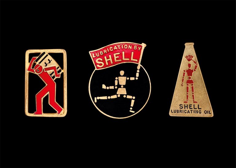
Sometimes we can trace that journey particularly clearly. E. McKnight Kauffer provides a fascinating example. Working for major commercial clients during the inter-war years, he created images built upon bold silhouette, geometry and immediate recognition.
Two very different characters in my collection demonstrate that economy. For Shell, Kauffer’s machine-like Mechanical Man belonged unmistakably to the modern world of motoring and petroleum. For John Jameson Whiskey, his Barrelman emerged from advertising produced by the London agency W. S. Crawford, where Kauffer worked in the late 1920s.
Reduced to little more than an inch of metal and enamel, neither character loses its identity or personality.
The scale changes; the strength of the idea doesn’t.
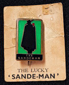
The wonderfully mysterious Sande-Man offers another example. Cloak, hat, glass and silhouette are enough. On its surviving promotional card, boldly announcing ‘THE LUCKY “SANDE-MAN”’, the little badge becomes part of a much wider graphic identity.
Deco containing Deco
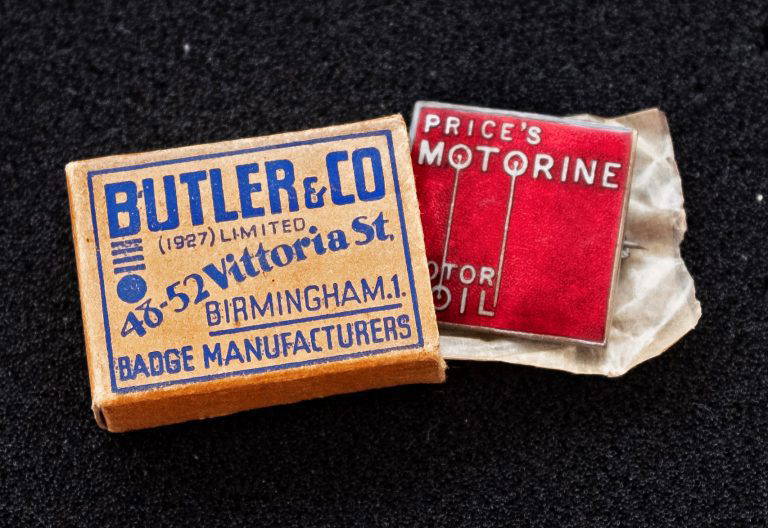
One of my favourite examples came with an unexpected bonus. A Price’s Motorine oil badge survives with its original packaging box from Butler & Co., badge manufacturers of Vittoria Street, Birmingham.
The badge itself is extraordinarily economical: MOTORINE stretches across the red enamel field while its central letters become long vertical lines terminating in the circular forms of MOTOR OIL below. Motorine advertisements from 1931 and 1932 use the same visual vocabulary, placing the badge within an established advertising identity.
A few years later, Price’s Motorine also commissioned A.M. Cassandre, who produced posters for the company in 1934 and 1935. There is no evidence that Cassandre designed this badge, but his involvement places Motorine firmly within the sophisticated world of inter-war commercial graphics.
And then there is the box. Its blue typography and geometric arrangement possess a Deco character of their own. Beside the brilliant red badge it creates a delightful visual conversation: Deco containing Deco.
Anonymous designers, confident graphics
Famous names are seductive, but most badge designers remain anonymous — and some of the strongest designs in my collection have no celebrated name attached to them.
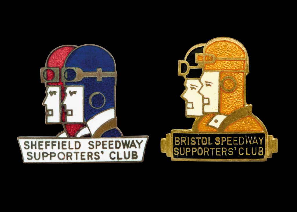
Speedway provides wonderful examples. Supporters’ club badges from Sheffield and Bristol use paired profiles, helmets and goggles, yet each finds a distinctive solution through geometry, colour and silhouette. Their names may be lost, but the quality of their graphic thinking certainly isn’t.
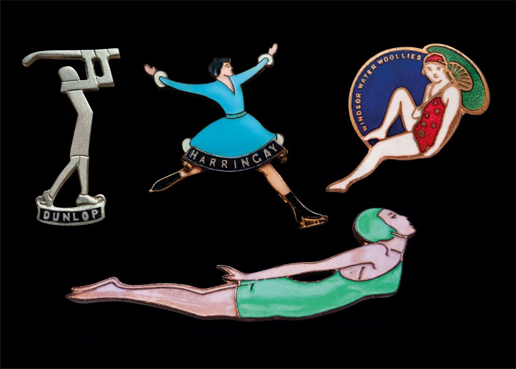
The female figure appears repeatedly too: golfers, skaters, swimmers and holidaymakers. Bodies are stretched, simplified and stylised — sometimes almost to silhouette, elsewhere through sweeping curves and elongated limbs.
These aren’t simply decorative women. They belong to the emerging visual world of modern leisure — sport, ice rinks, swimming pools and fashionable holidays: athletic, elegant and unmistakably in motion.
Look across the collection and a little social history emerges: speedway, skating, swimming, cycling, golf, rambling, holidays, cinema, radio, motoring, petroleum, dancing and ocean travel. Even civil defence makes an appearance.
Together, the badges become something more than attractive designs. They offer a visual snapshot of inter-war social history.
The badge went home
Today these objects sit carefully arranged in collectors’ trays and cabinets, but that wasn’t what they were made for. They belonged in the world — pinned to jackets and coats, taken on holidays, worn to sporting events and workplaces, and carried through towns and cities.
That, for me, is what separates them from so many other manifestations of Art Deco. Someone conceived the graphic idea. Someone else found a way of turning it into metal and glass. And then somebody wore it.
Unlike the paper advertisements and packaging that so often disappeared, many of these little pieces of vitreous enamel have survived remarkably intact, their colours and graphic identities still speaking to us almost a century later.
Art Deco could be monumental, luxurious and expensive. But it could also be miniature, inexpensive, portable and democratic.
The poster stayed on the hoarding. The badge went home with someone.
by Sonia Grant If we think of the south coast and Art Deco, our minds automatically go to the iconic Saltdean Lido. But just along the coast are three much smaller examples of Art Deco architecture which whilst not as imposing are also noteworthy. Unlike other Art Deco buildings or structures in Brighton and Hove […]
The 1930s in Britain saw a widespread movement promoting outdoor health and fitness, reflecting similar developments across Europe. Days spent at the lido were a leading pastime. It was an opportunity not only to cool down, but to exercise, socialize within the sensuous curves of the finest International modernist ‘art deco’ architecture, the perfect expression […]
The Bystander captures two of the most popular past times of the interwar period: bathing and greyhound racing. Laurie Taylor, 1930. By Lucinda Gosling. Images courtesy of Mary Evans Picture Library (unless otherwise stated) A century ago, on 24th July 1926, greyhound racing came to Britain. The location for its debut was Manchester, specifically Belle […]